Julian Opie
24.10.—10.12.2025
“The Angel” is an area within the borough of Islington in London. The name refers to a famous coaching inn on the road into London, back when Islington was a village some way out of town. It’s now a lively, casual shopping area and features on the Monopoly game board in blue. I lived around this area for decades and my studio is a couple of miles to the south.
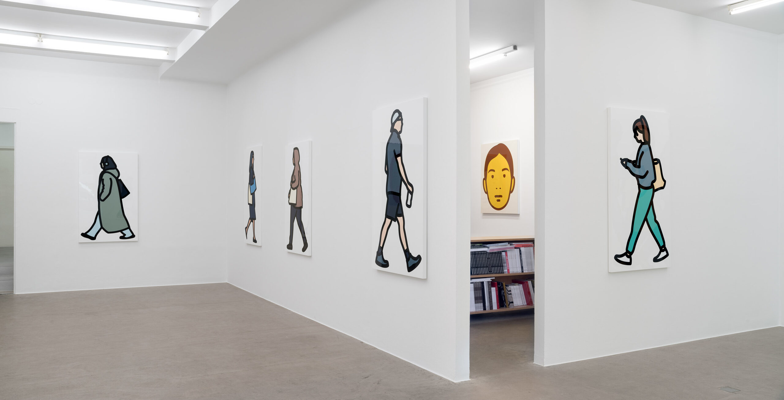
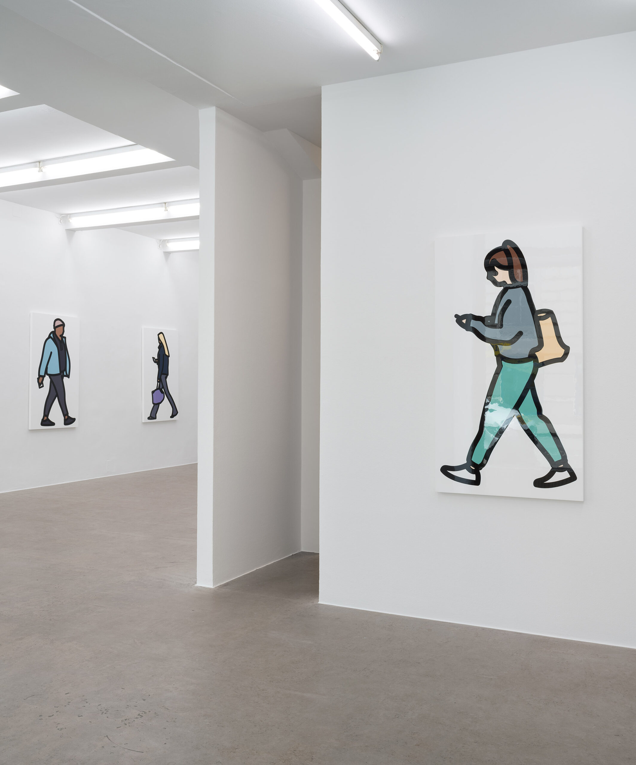
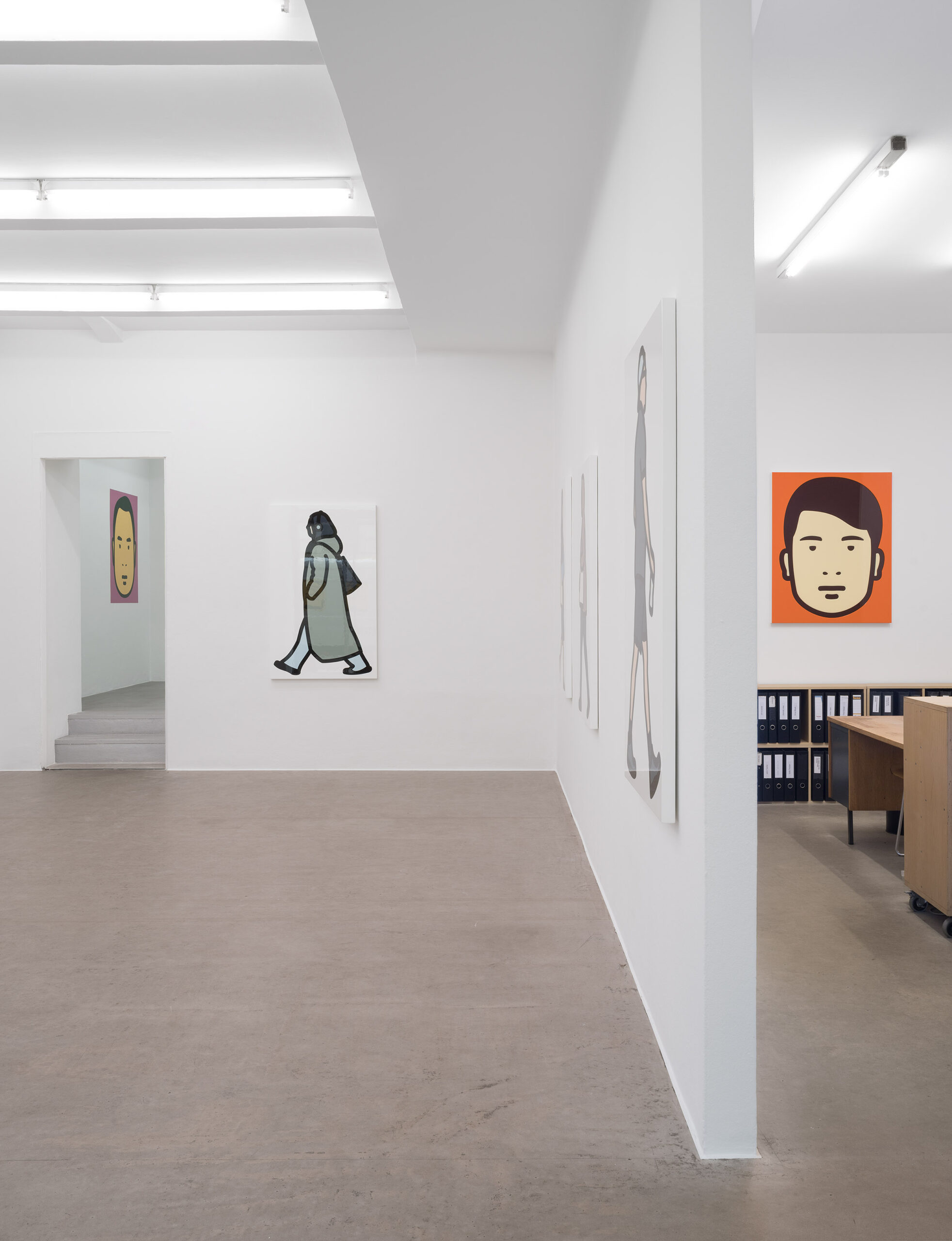
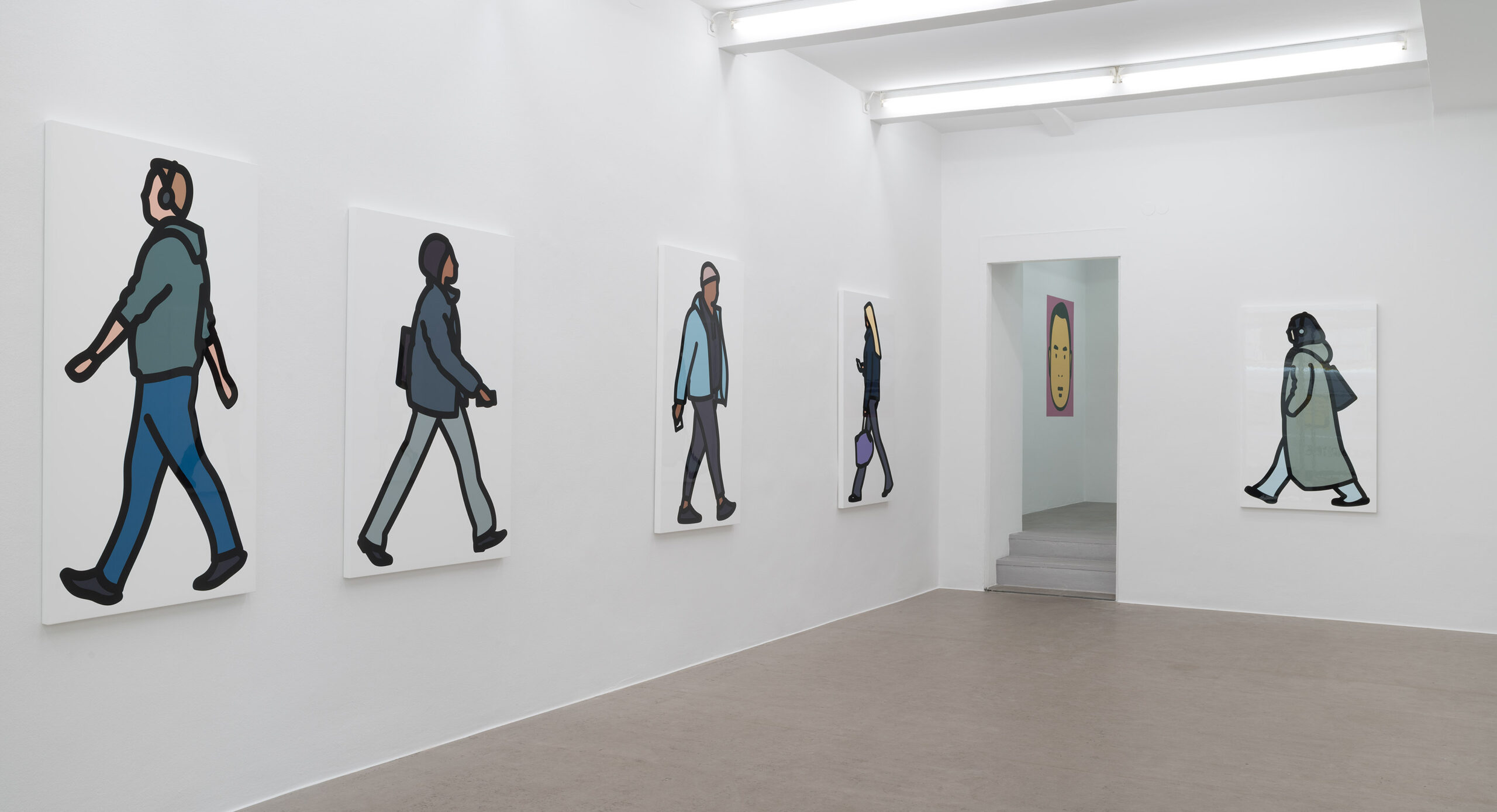
After finishing two long projects that were carefully planned and quite proscriptive, one of young school children and the other of the British Olympic sprint team, I wanted to do something more normal and immediate, a sort of “back to basics” project. I took a rental bike up to the Angel and found a discreet position on a traffic island in the middle of Upper Street, the wide shopping street leading down to the Angel proper. I leant my phone against a lamp post at waist level and clicked rapidly as pedestrians walked past on the far side of the road. I need to be some meters back from a flat area of pavement somewhere that people have room to walk straight with not too much traffic in the way. Every now and then someone notices what I am doing and a couple of them complained to the police. The officers wandered over to ask what I was doing but were happy with my explanation, even apologising for bothering me.
At the time I thought it wasn’t going well but I stayed on for over an hour, taking hundreds of photos. While I’m working I tend to feel I have picked the wrong street and the wrong time of day and that no one interesting is passing by. However once back at the studio and sorting through the photos I realised it was a rich catch. The supply of passing humans in London is like an endlessly flowing river. Things that can vary are weather, time of day and type of person, ranging from local to tourist to business. I often film and photograph people outside my studio but this area gets a bit predictable and limited in terms of clothing and style. The Angel is pretty mixed. It’s the main shopping street for a huge area. The weather was mild but occasionally raining (I did not want people with umbrellas).
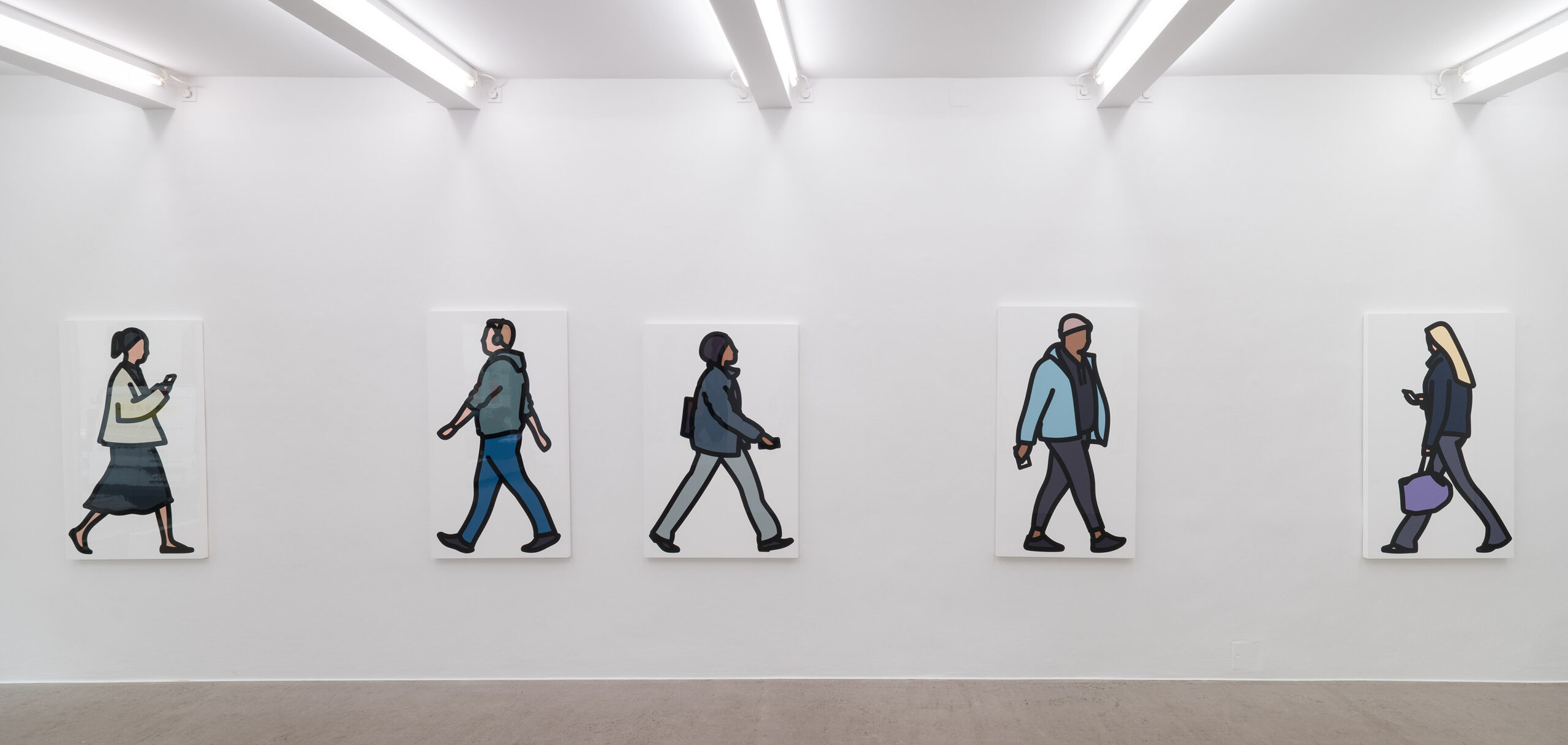
Out of hundreds only a few photos are usable. Most I reject as there is something I can’t draw, like a fur collar, or the legs are in an awkward position or – more often than not – they carry a difficult to draw floppy backpack. I tend to draw an alternate man and woman to keep a good mix and by the end of an intense fortnight I had 40 new drawings of striding characters to play with.
I start a project with only a vague sense of where it might go. It’s a bit like going fishing and then deciding the meal based on what you catch. Or maybe it’s more that I need ingredients to play out and investigate my current interests and use the technologies and materials that fill my mind at that moment.
I spend some of my time in the countryside and this kind of project wouldn’t be at all possible in the small villages nearby. For one thing I slightly know many of the people one might see there, they would stop and chat and not many people pass by anyway. This kind of people watching and anonymity is only possible in a big city where you are surrounded by strangers willing to ignore you. Those I draw are looked at while they go about their business oblivious of being watched. They seem noble and even magnificent in their personal worlds striding past and disappearing for ever, allowing me to turn them into an emblematic logo of themselves (Google tells me that “Logo” comes from the ancient Greek for word and mark). If the person becomes a word, then a crowd becomes a sentence. Perhaps like hieroglyphs or poems.
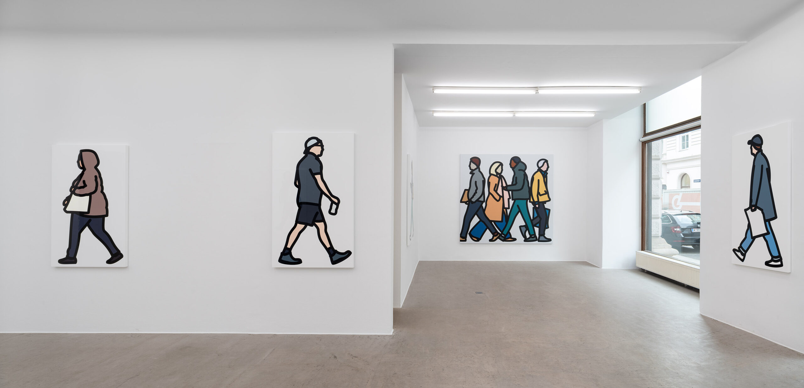
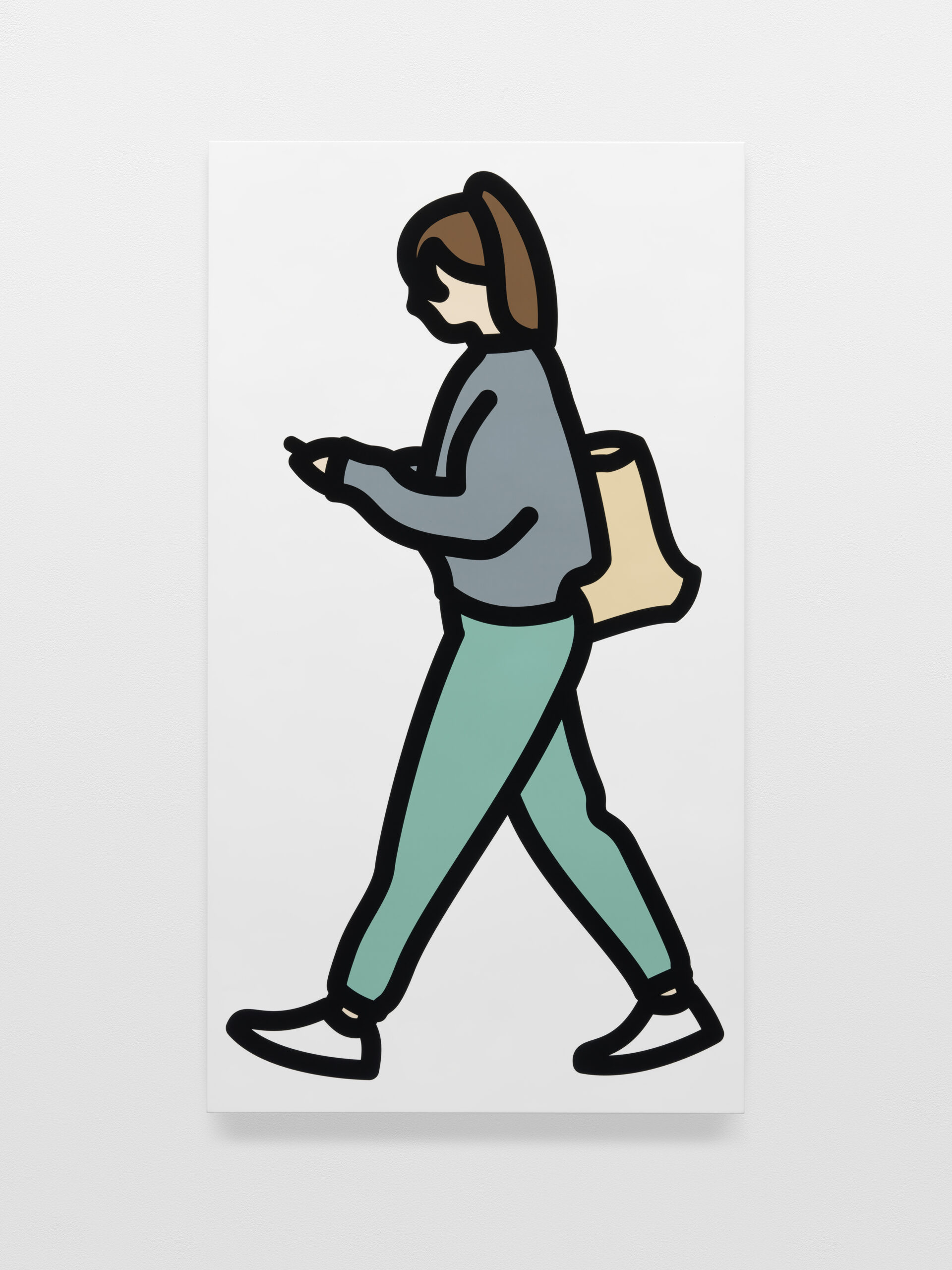
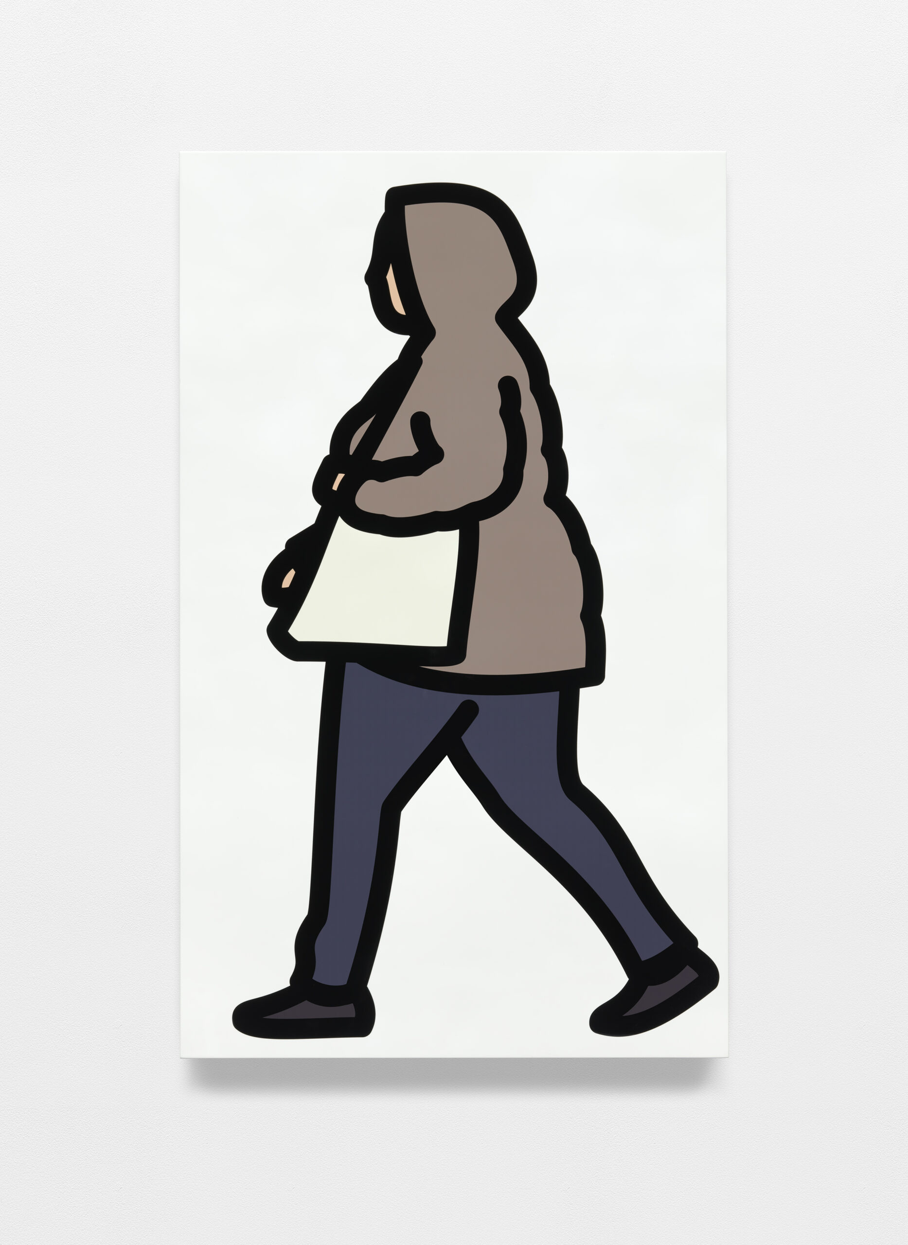
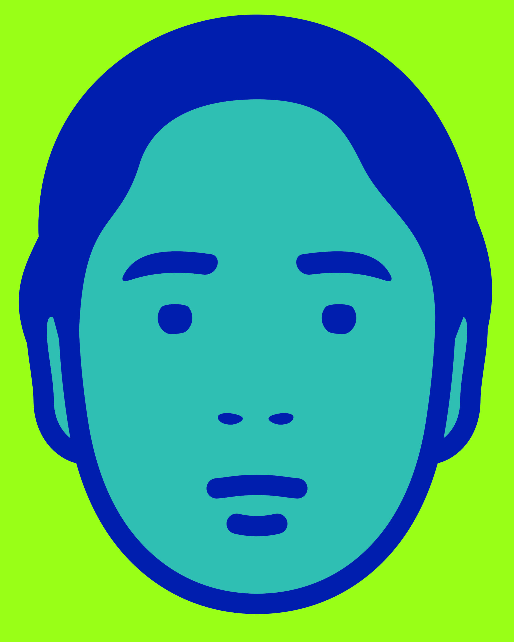
I wanted these people to be straightforward and easy to read. I aimed to achieve that by giving them naturalistic colours and quite a lot of detail including shoes and even noses. The addition of noses came as quite a shock to me after years of drawing flat faces. Often I only use a circle for a head and leave out feet altogether.
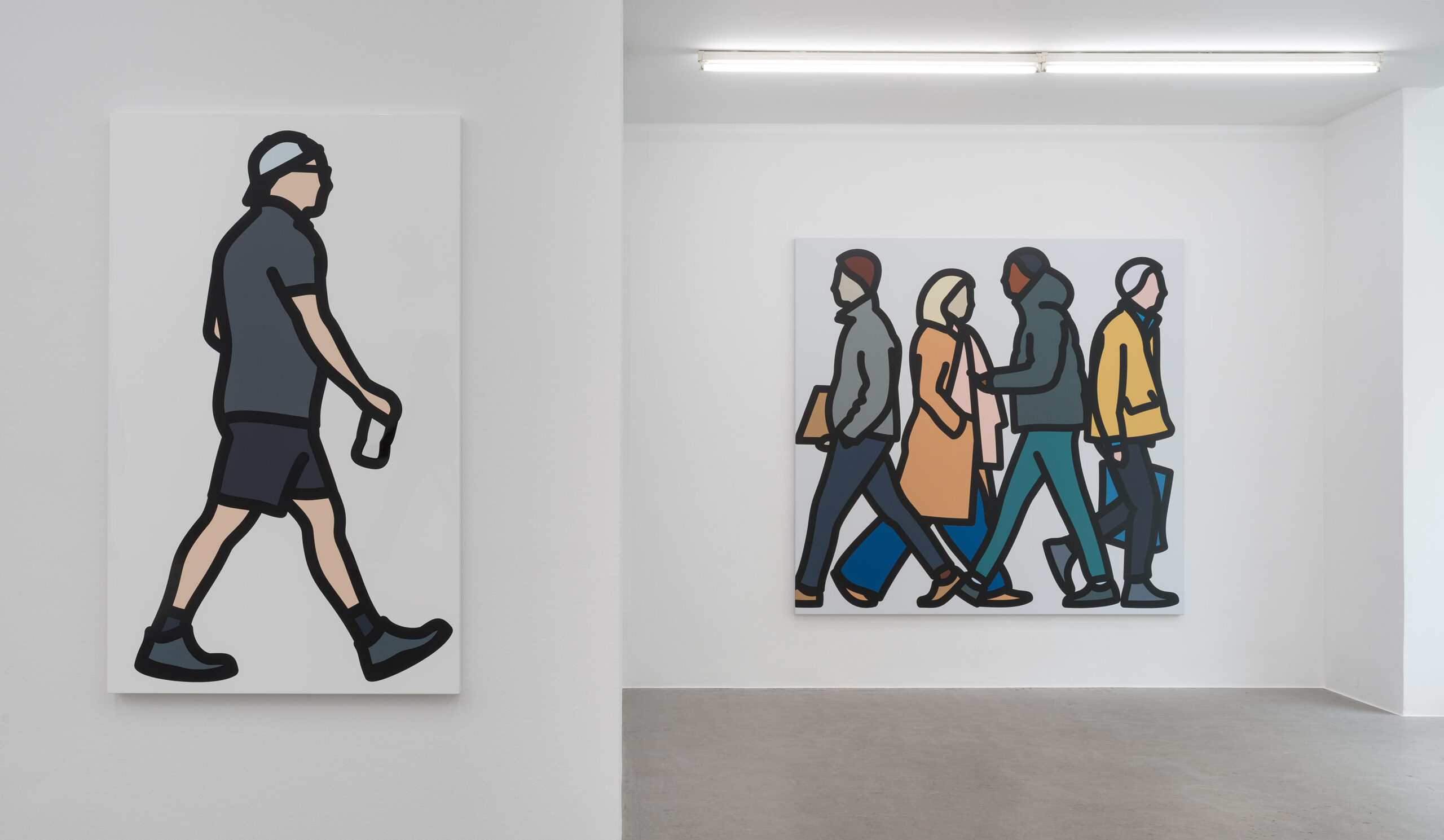
My first aim was to make very large-scale group paintings that echoed classical friezes depicting striding Assyrian warriors or gift-offering Egyptians, but using everyday contemporary people. I have experimented with drawing friends or people paid to come in from the street to be filmed, but the glory of filming out on the street, which is arduous and slightly frightening, is that you get the raw truth. I didn’t notice at the time, but most people are wearing baggy clothes which my children tell me are fashionable right now. Many people look at their phones and each walks in their own personal way and speed. The way you walk is as telling as your voice or handwriting. I can capture these qualities without making any decisions myself. Only when I combine the figures in groups of four do I get involved in decisions.
Warhol wrote of making an artwork, ‘If you don’t think about it, it’s right. As soon as you have to decide and choose, it’s wrong. And the more you decide about, the more wrong it gets.” I find that’s a good guide. The rules of composition are based on maximum difference and rhythm. An even mix of dark and light clothing of short and tall people (which often tends to be male and female), a mix across the canvas of dark and blonde hair, visible and clothed limbs, direction of walk.
Like the people themselves, the painting system I have used is taken from the street. The most ubiquitous form of city outdoor imaging might well be this cut vinyl on stretched nylon sheet used for signage and advertising, but here used as a very sensible and seamless way of making a large image. In fact, there is almost no limit to the scale that is possible. Meanwhile I have the 40 individual figures to play with. The stretched vinyl system makes little sense in this smaller scale and since the viewer will be closer to the image, it seems possible to push the surface to an extreme of high gloss and pure seamlessness. Unlike etching and lithography, silkscreen used to be considered too lowly a technology to use for art, like a ballpoint pen. But slowly it has become the deluxe choice for printing, while inkjet became the lowly office form of printing that couldn’t be trusted for artworks. Now in fact inkjet printing has taken over; it’s cleaner and easier and gives an even richer surface. No more tricky edges to line up or hairs in the ink or tedious, slow colour proofing. I spray a thick layer of varnish over the whole object to give the image an even more removed and dreamy quality, perhaps a bit like looking through glass.
Thinking again of Warhol’s advice I have avoided a decision on background colour. In previous works I sometimes actually cut the background away to leave a canvas shaped to the figure depicted, but here I have painted the board white so that it merges with the white gallery wall leaving the figure free of constraints, to appear to walk around the room. Note to potential collectors, please hang these on white walls where possible. I have not used a white background before and am surprised at how stark and colourful it makes the person look.
The Angel project is recent but since then I have started two new projects. The first is again walking street people but filmed rather than photographed to make animated artworks. I filmed in the warm summer evenings on Saturday nights around my studio. This is now a renowned clubbing area and I hoped to get a different crowd without rucksacks and dressed to impress.
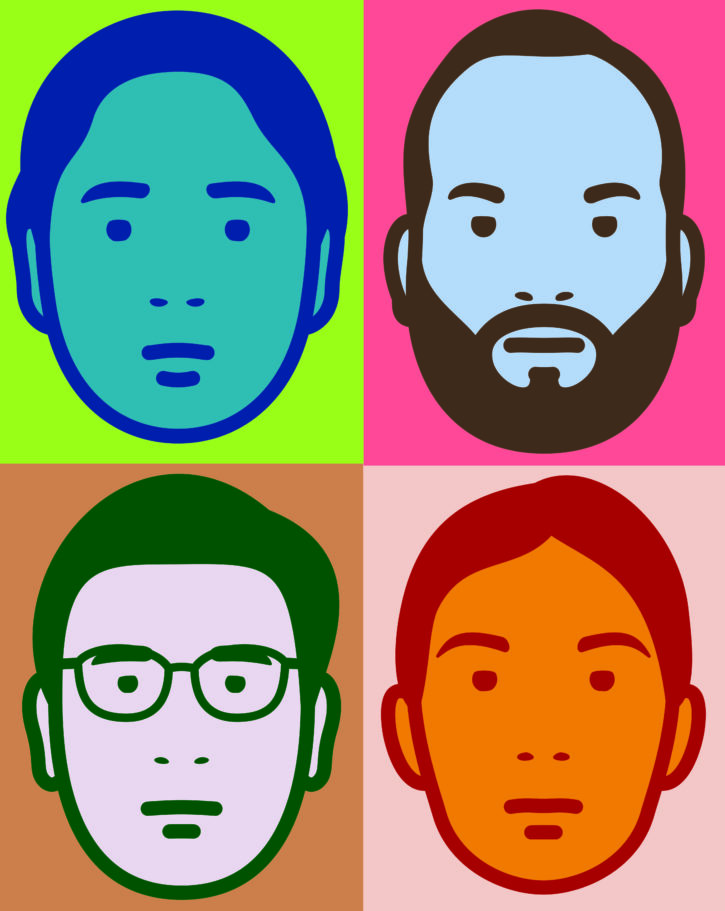
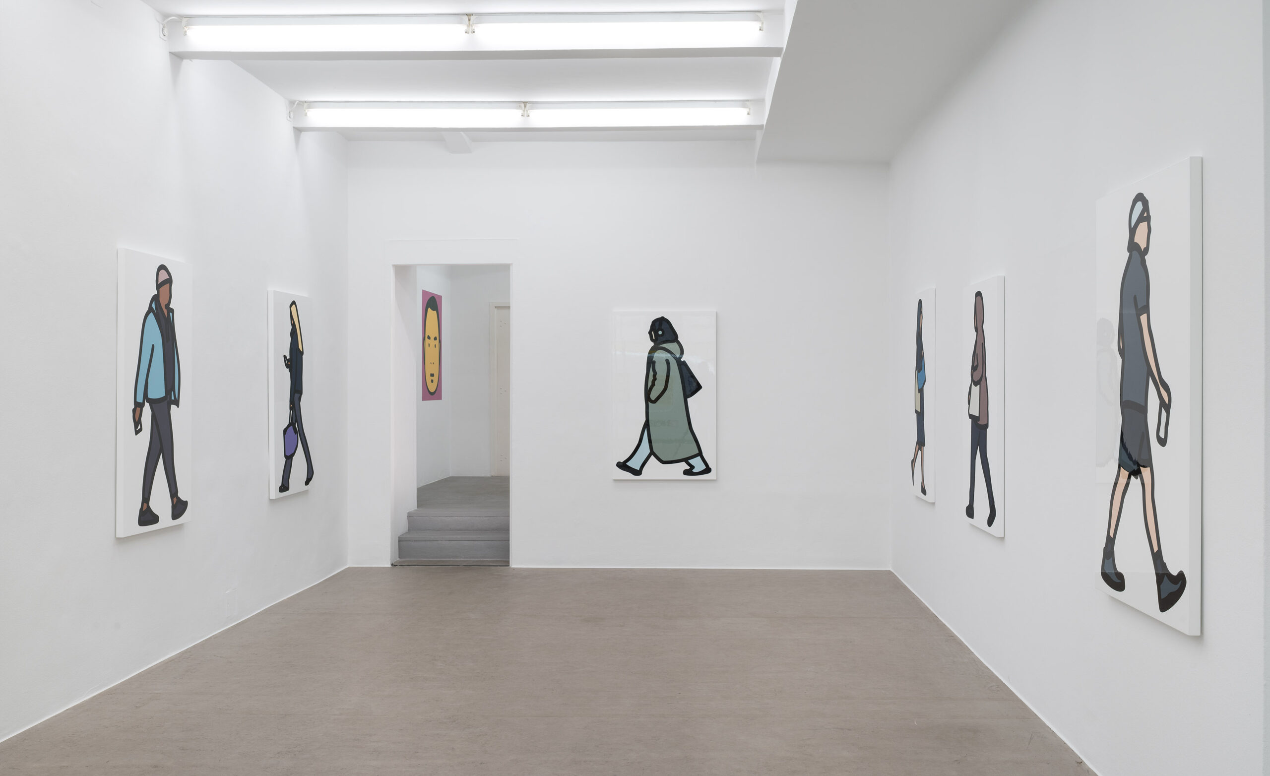
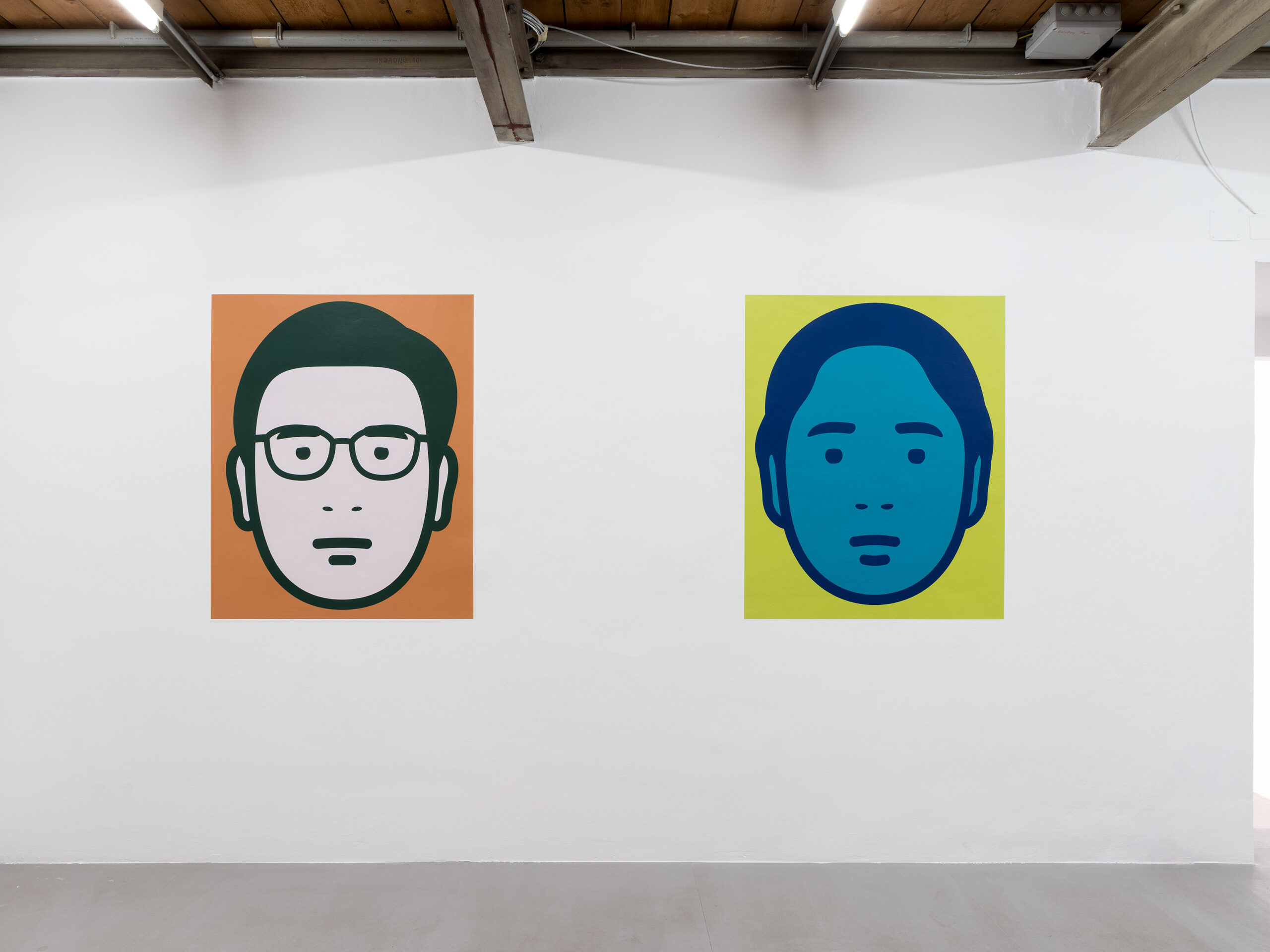
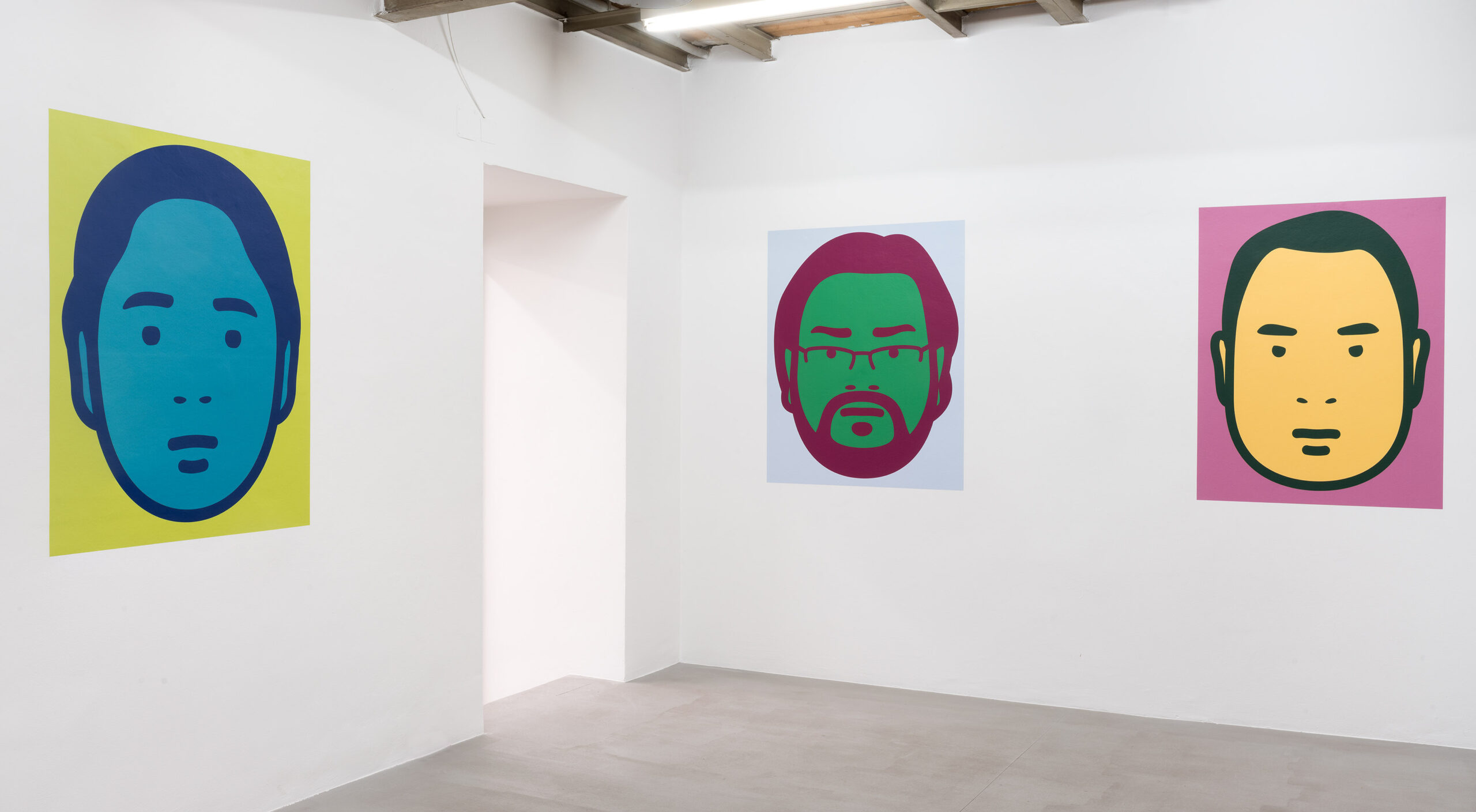
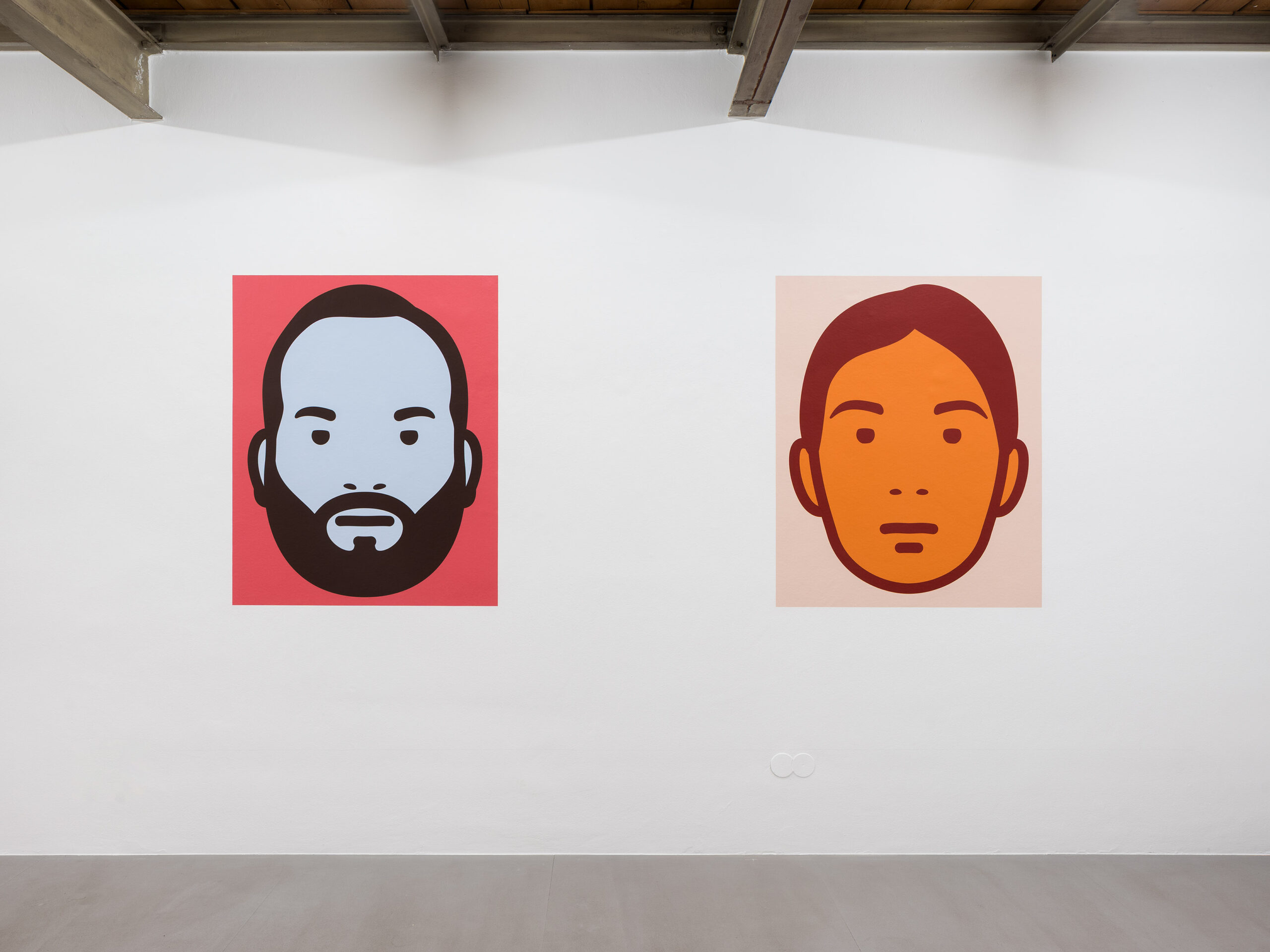
The other project, I started on a trip to India where I asked everyone I met to pose for a face only portrait. Back in London I used these straight-on photos to create the simplest portraits I could manage. They are (apart from hair) completely symmetrical and lack a body or a neck. Part of the reason for the simplicity is to help a future plan I have to create an AI programme that can do the portraits for me. For this set I drew them myself but aimed for a kind of emblematic, universal brand image for each individual. I then used Hindu inspired bright colours, often seen on images of gods, and used to paint the facades of village houses I saw in Southern India. I made a maximum contrast palette of four dark colours, four mid tone and four light colours. These are randomly allocated to each portrait with the dark colour used as the drawn line. As with maps these few colours are all that are needed to differentiate and maximise the areas of the image.
I am frustrated by the way in which high prices limit the availability of artworks as things to own. I love to collect art myself. It’s something very special and particular to actually have an artwork I love and can see at my leisure in my own home rather than a gallery. Seeing it repeatedly over time adds unexpected layers of enjoyment and engagement. Even limited- edition prints (of which I make many) remain relatively expensive compared to say music or books. With this group of works I conceived of a plan to make an uncompromised artwork that could be sold at a low price. I wanted to use a technology that is everywhere but is also quite extraordinary, wallpaper. These are like street posters and once affixed to a wall create an almost disembodied floating image that is literally paper thin. The paper is plasticised and sticky backed.
I also designed an invite card that consists of four of the portraits made as peel off stickers.
Julian Opie, 2025
Julian Opie*1958 London. Lives and works in London.
Further informations:
Installation view: Photo: Rudolf Strobl
Installation view: Photo: Rudolf Strobl
Installation view: Photo: Rudolf Strobl
Installation view: Photo: Rudolf Strobl
Installation view: Photo: Rudolf Strobl
Installation view: Photo: Rudolf Strobl
Installation view: Photo: Rudolf Strobl
Installation view: Photo: Rudolf Strobl
Installation view: Photo: Rudolf Strobl
Installation view: Photo: Rudolf Strobl
Installation view: Photo: Rudolf Strobl
Flares. 2025
Direct to media print on painted wooden board
136,2 x 80,7 x 3,6 cm
Unique
Flares. 2025 (Detail)
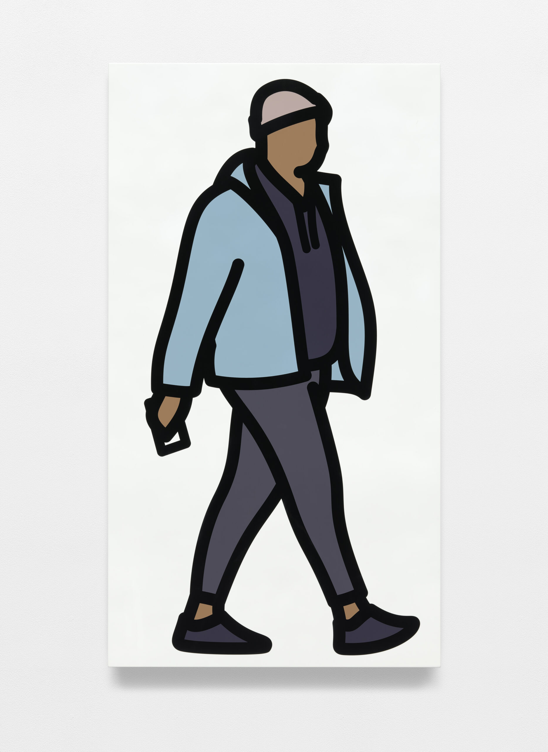
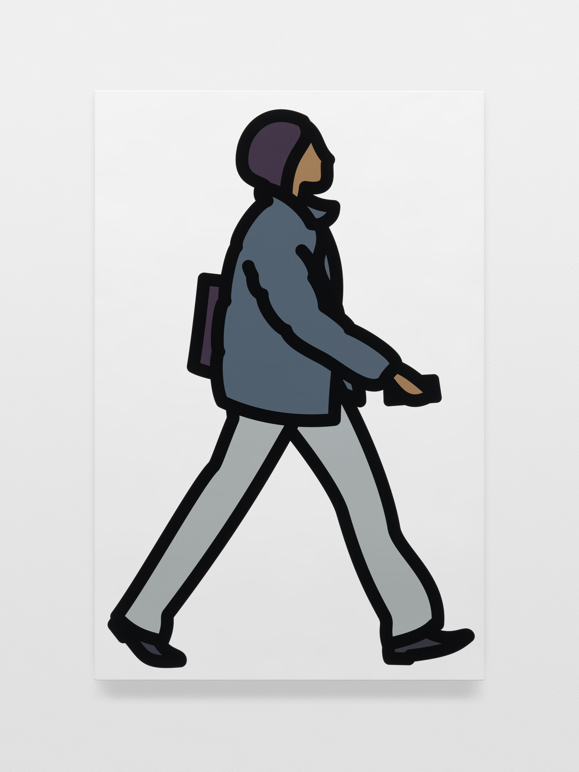
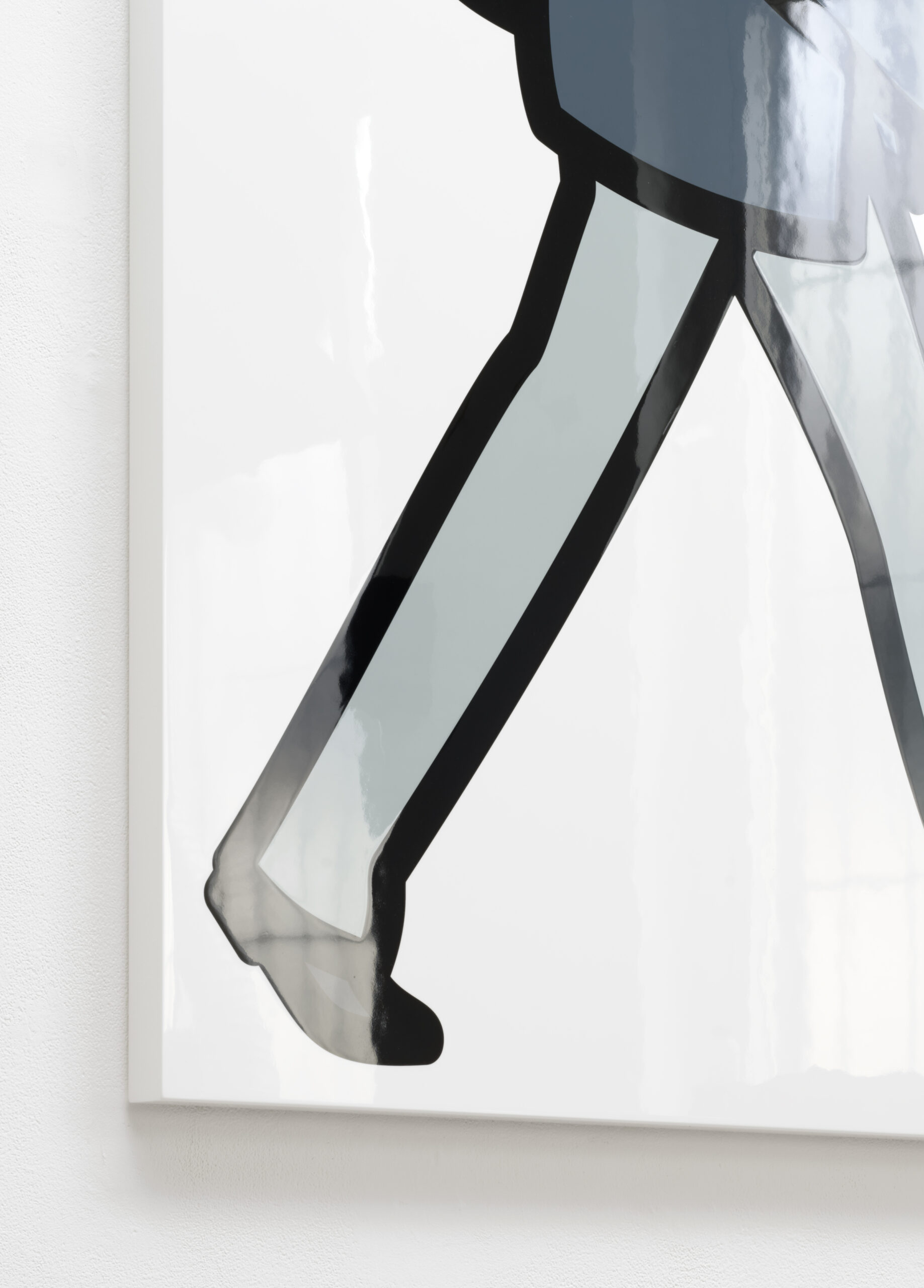
Wolly Hat. 2025
Direct to media print on painted wooden board
140,8 x 77,5 x 3,6 cm
Unique
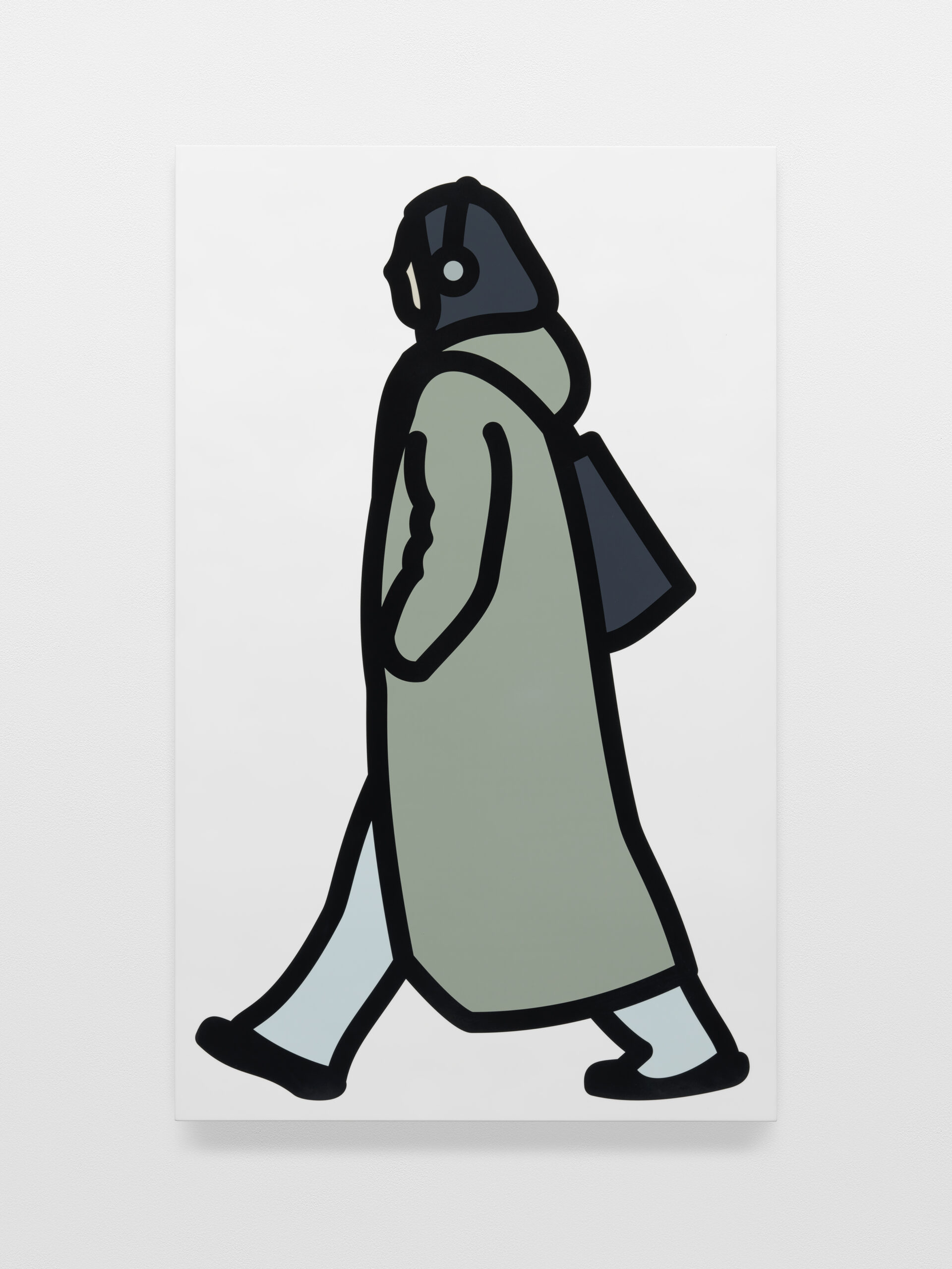
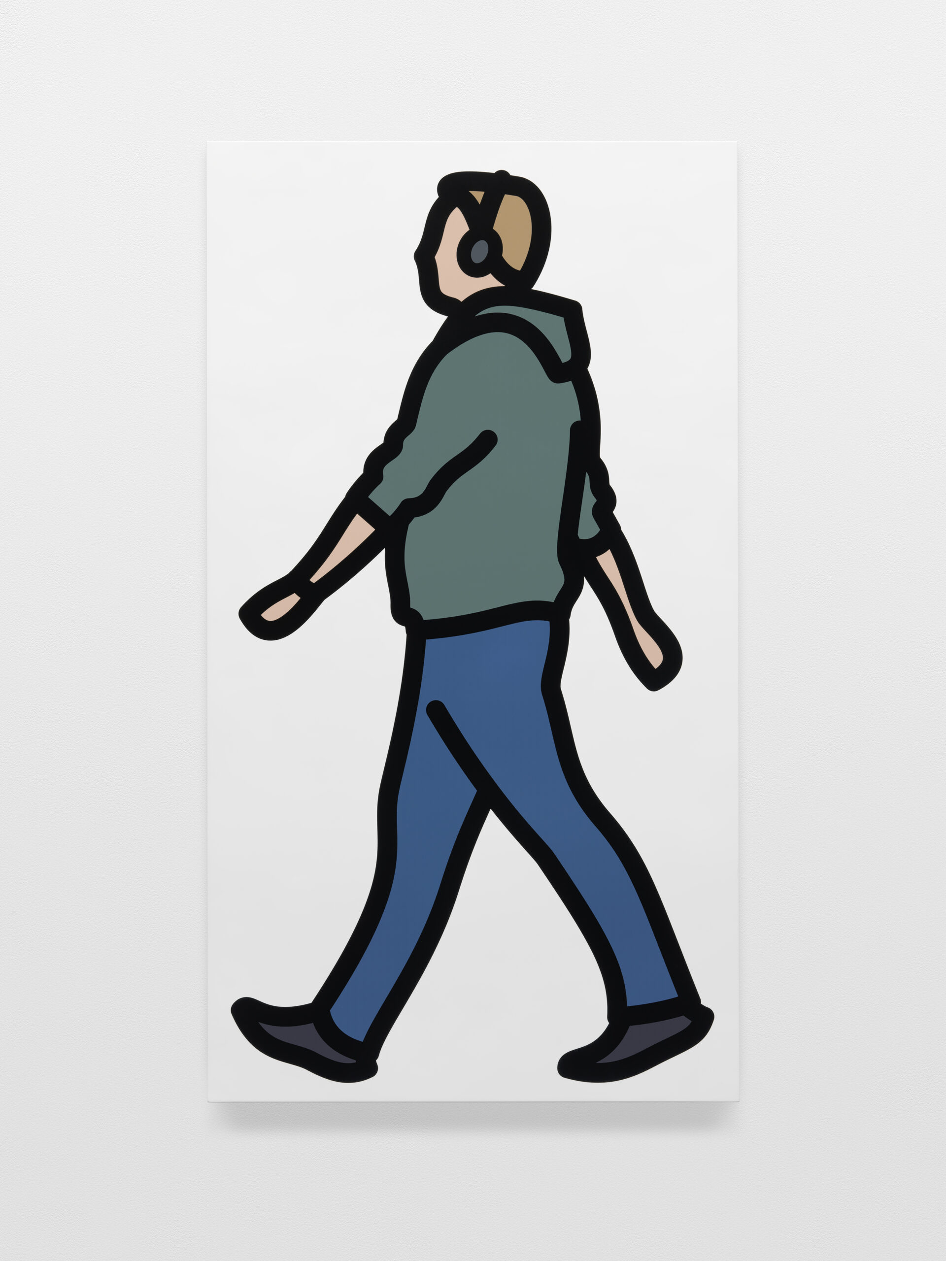
Headphones. 2025
Direct to media print on painted wooden board
132,4 x 81,7 x 3,6 cm
Unique
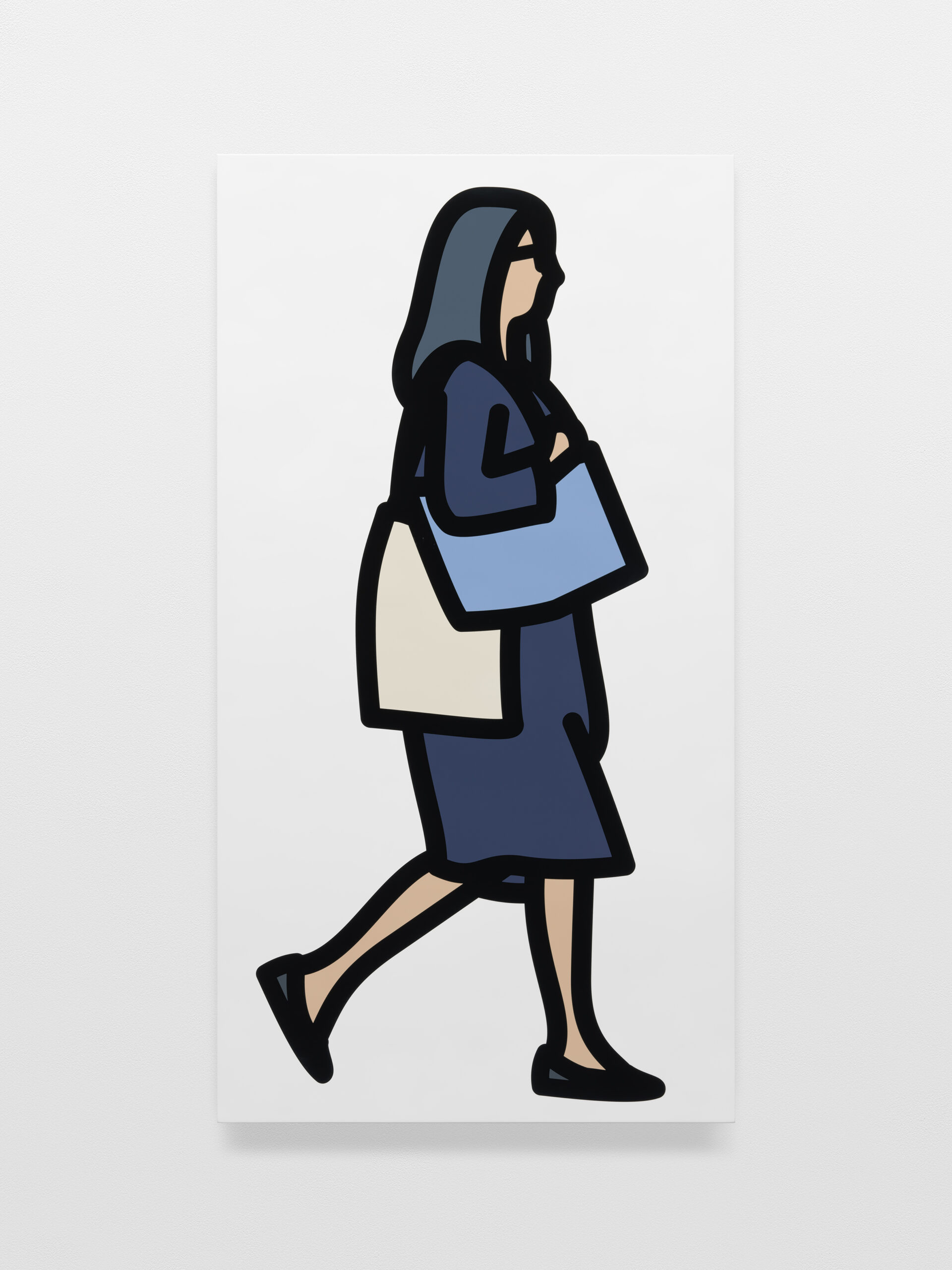
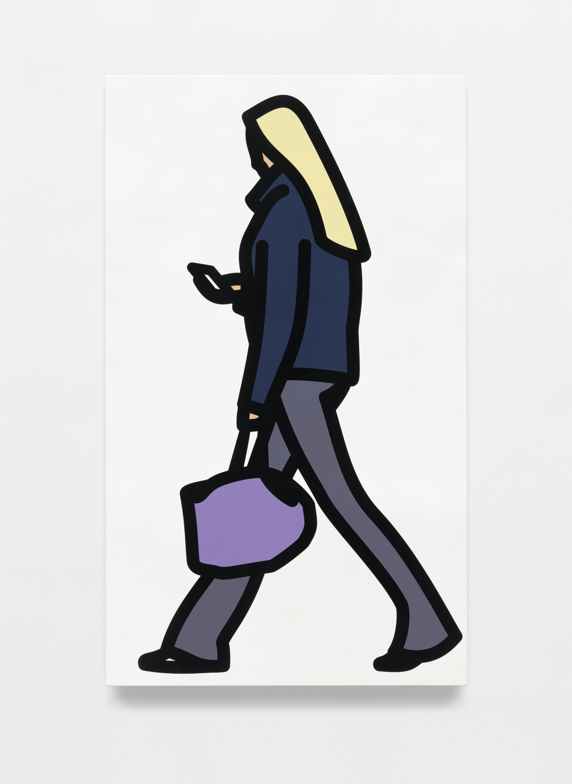
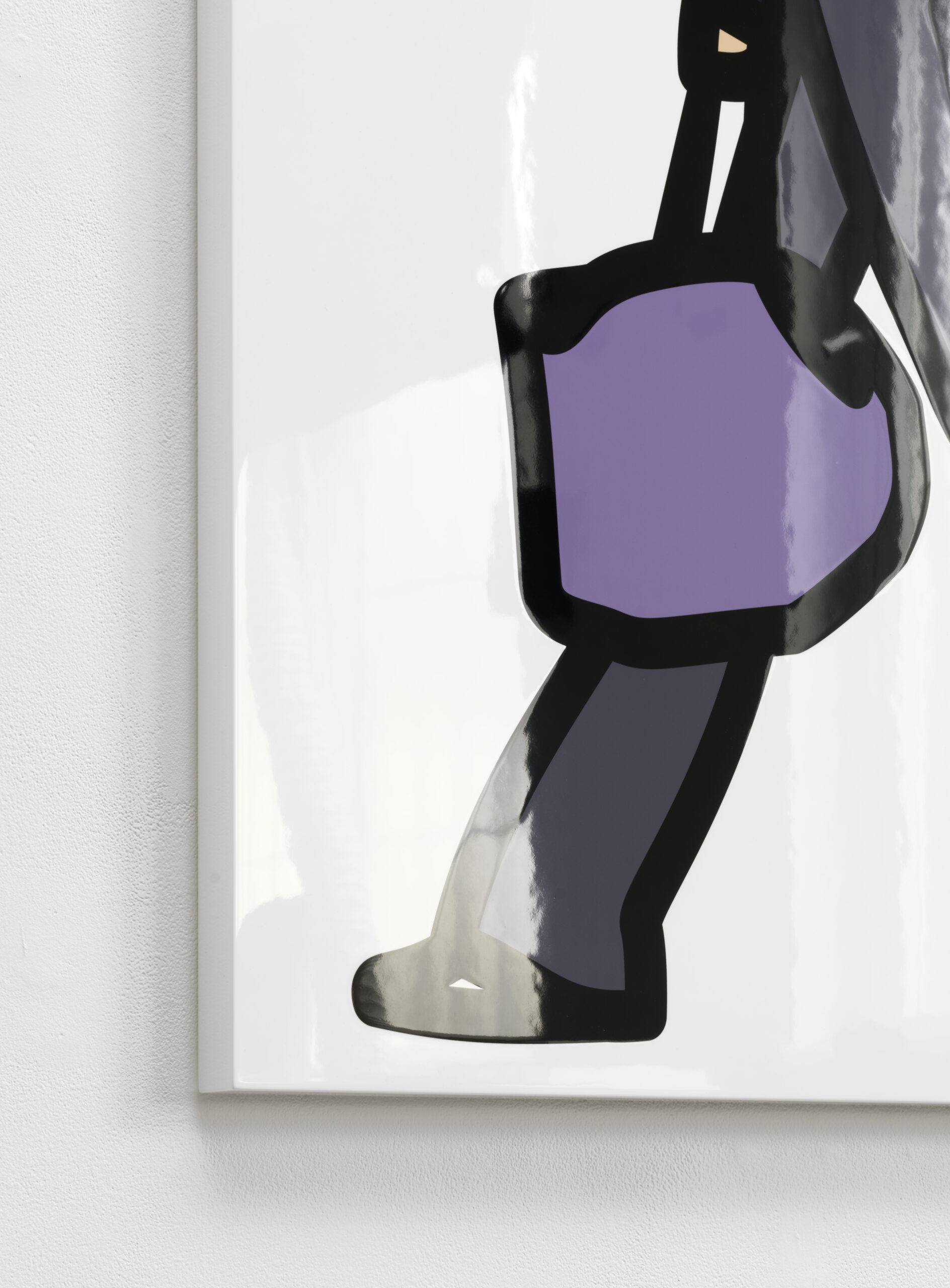
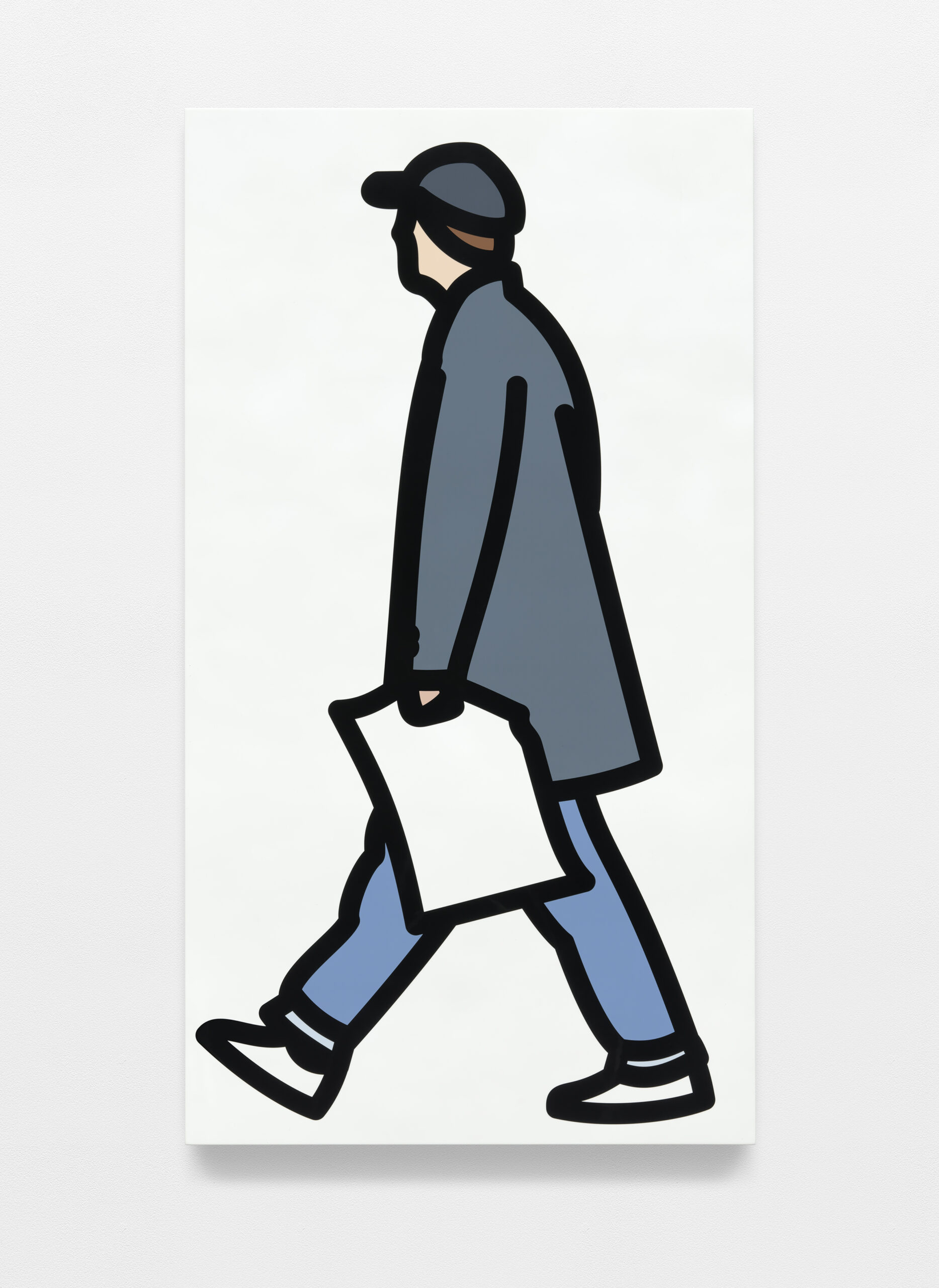
Bags. 2025
Direct to media print on painted wooden board
136,2 x 72,9 x 5 cm
Unique
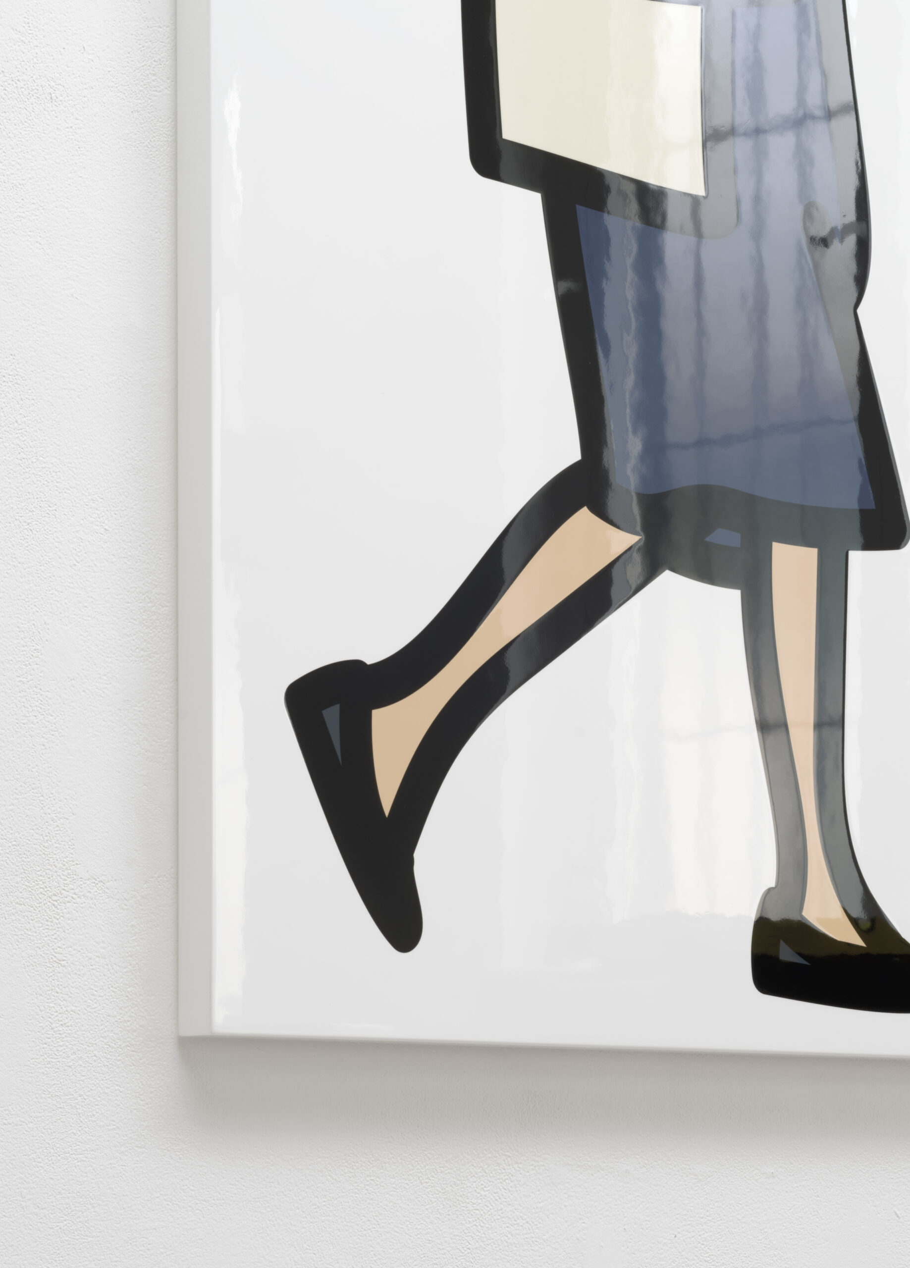
Bags. 2025 (Detail)
Jacket. 2025
Direct to media print on painted wooden board
131,5 x 87 x 3,6 cm
Unique
Jacket. 2025 (Detail)
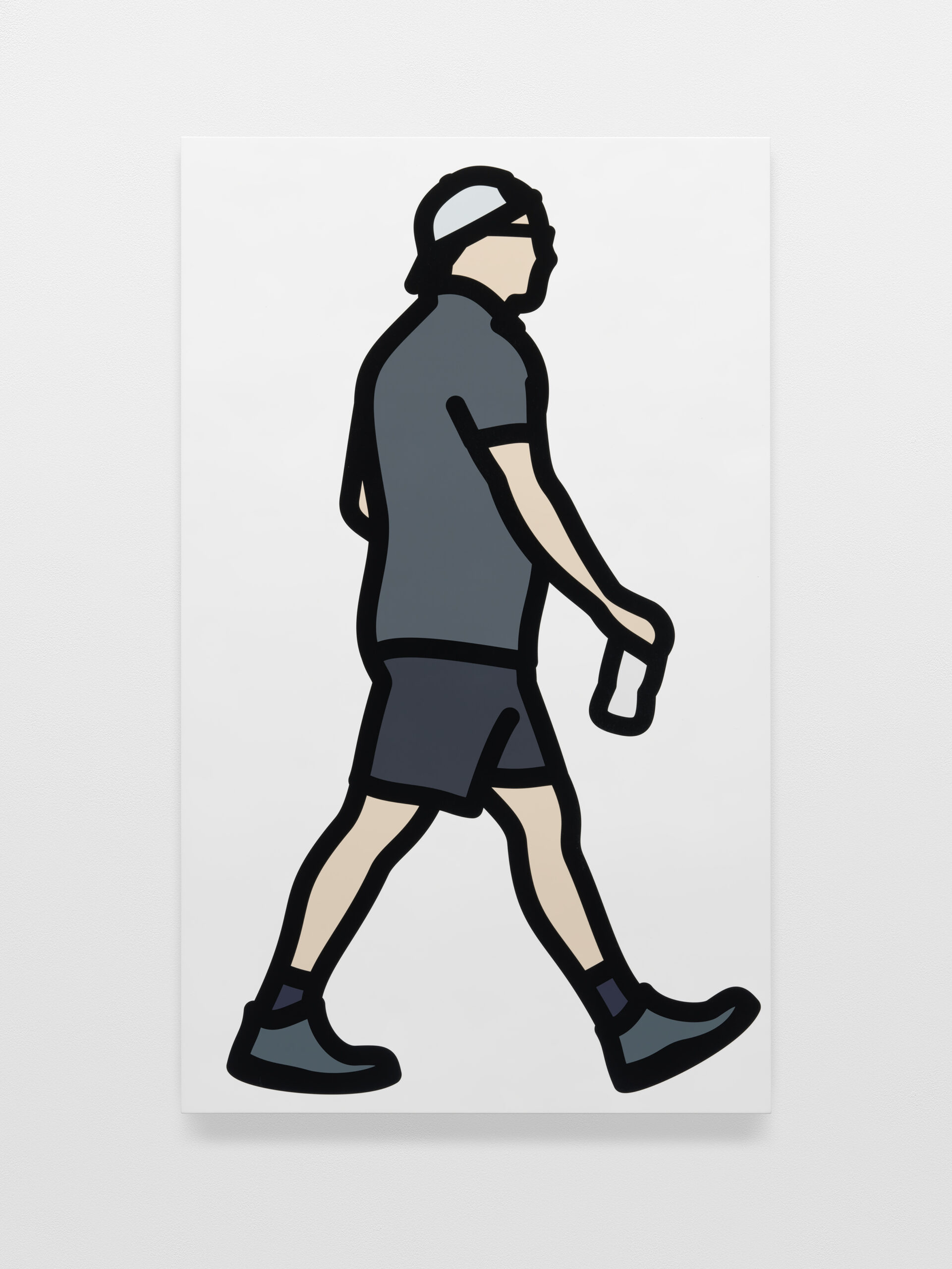
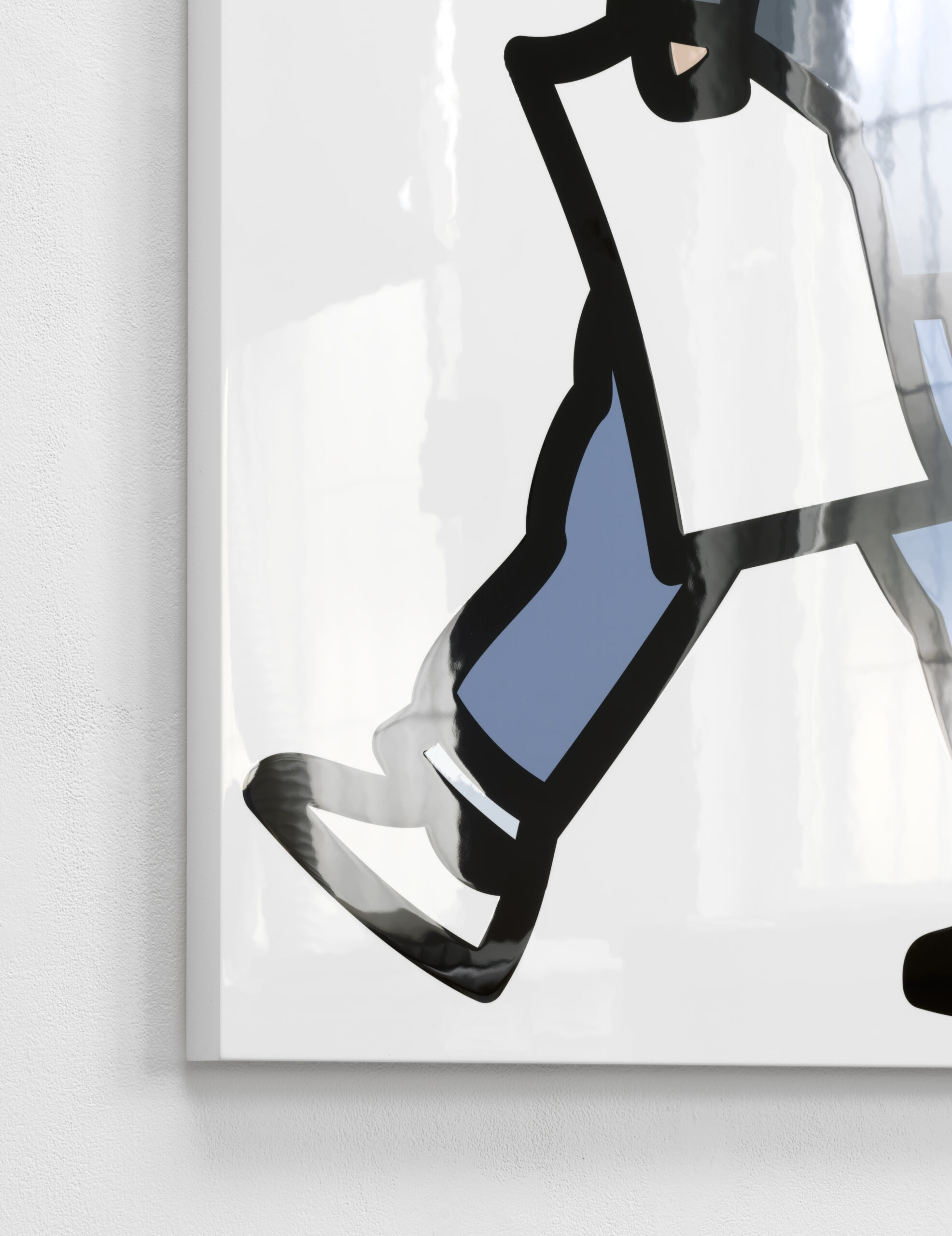
Bottle. 2025
Direct to media print on painted wooden board
140,3 x 84,8 x 3,6 cm
Unique
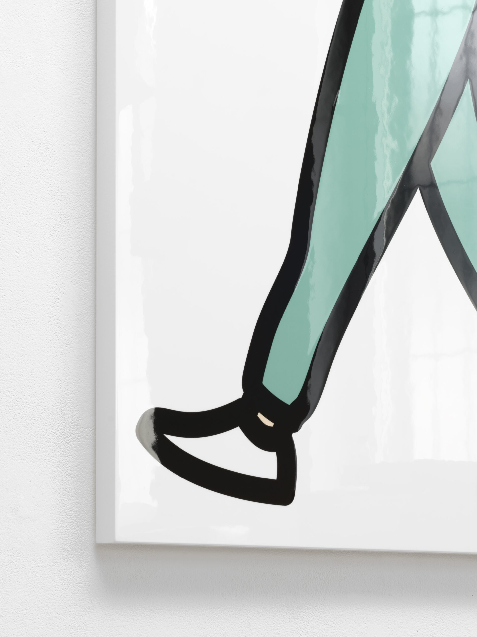
Jeans. 2025
Direct to media print on painted wooden board
138,8 x 76,8 x 3,6 cm
Unique
Pumps. 2025
Direct to media print on painted wooden board
133,2 x 74,7 x 3,6 cm
Unique
Mac. 2025
Direct to media print on painted wooden board
140,5 x 77,5 x 3,6 cm
Unique
Mac. 2025 (Detail)
Texting. 2025 (Detail)
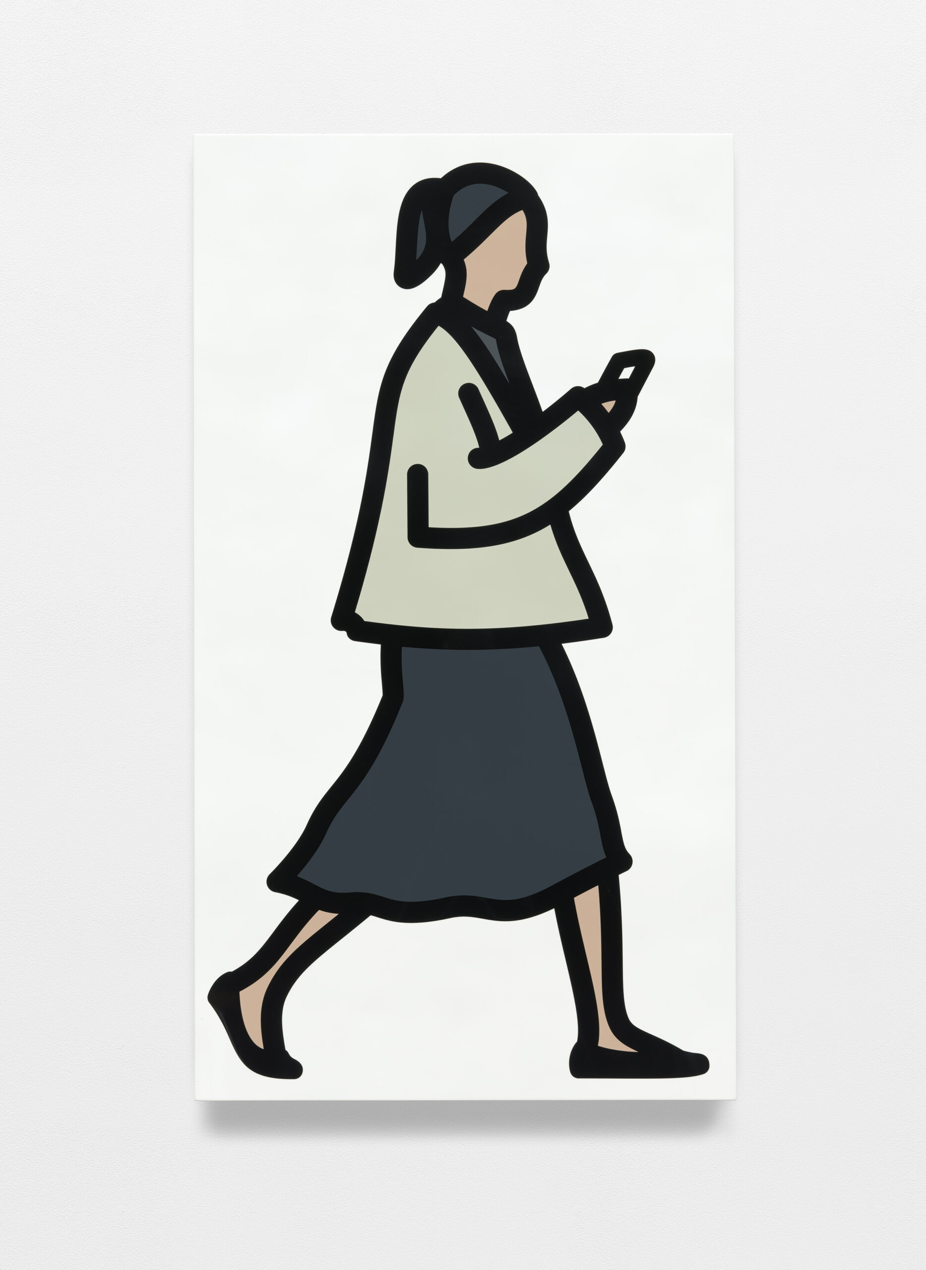
Texting. 2025
Direct to media print on painted wooden board
139,1 x 77 x 3,6 cm
Unique
Hood. 2025
Direct to media print on painted wooden board
127,5 x 77,1 x 3,6 cm
Unique
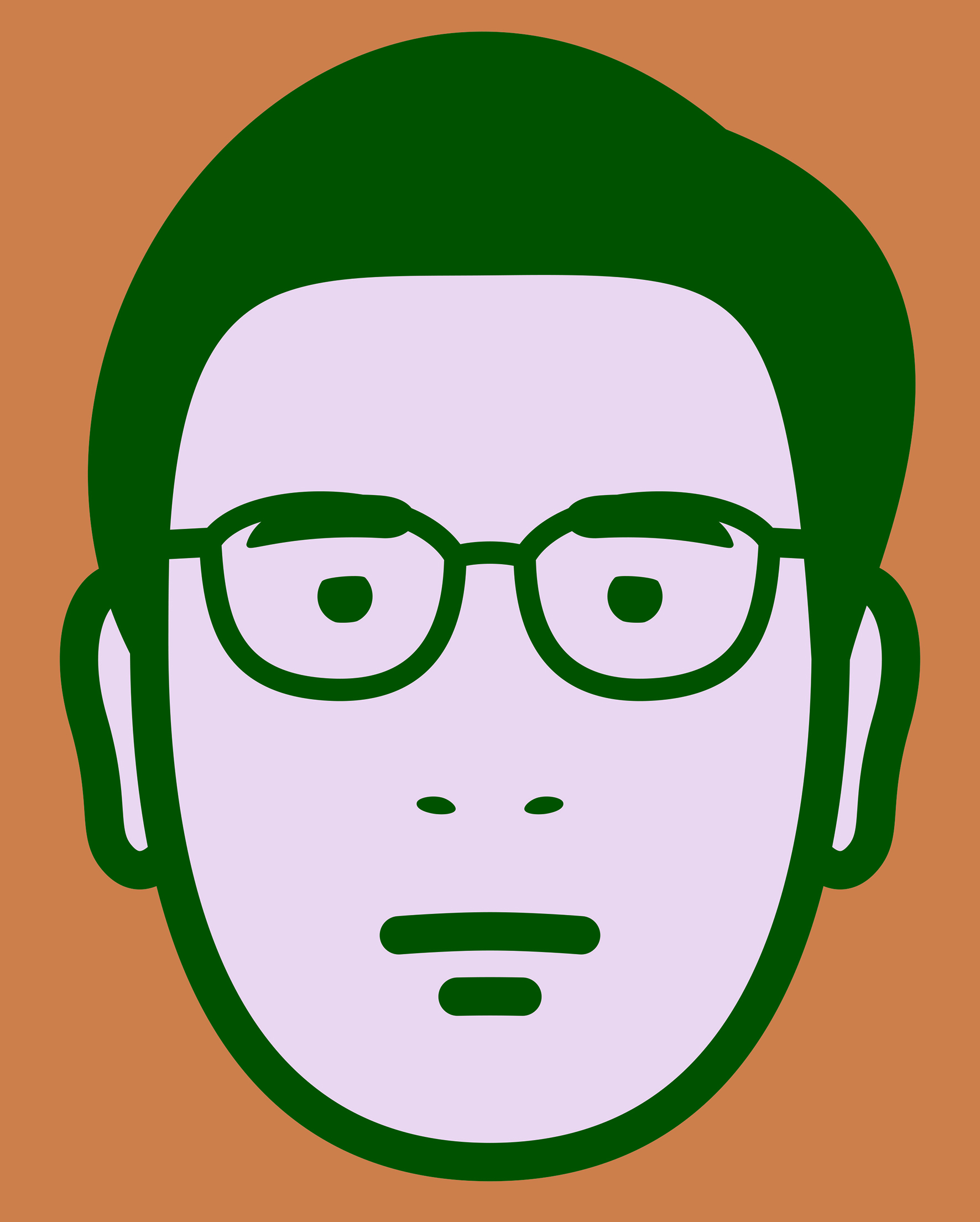
Abhishek. 2025
Wallpaper
120 x 95,5 cm
Unlimited Edition
Domber. 2025
Wallpaper
120 x 95,5 cm
Unlimited Edition

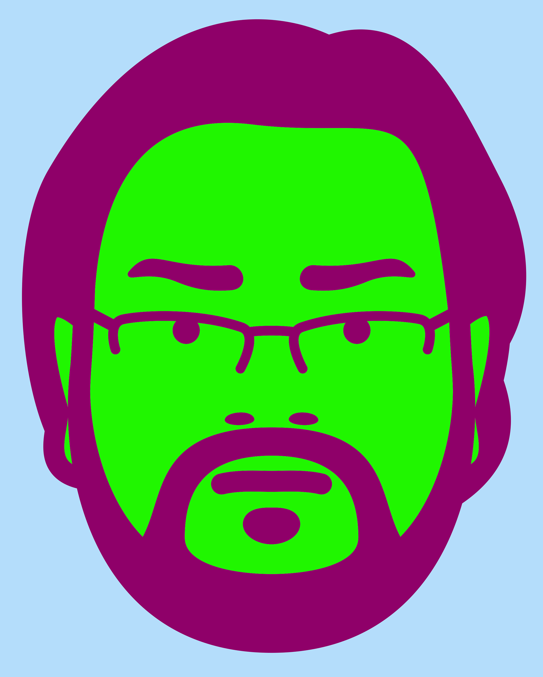
Kiran. 2025
Wallpaper
120 x 95,5 cm
Unlimited Edition
Saikata. 2025
Wallpaper
120 x 95,5 cm
Unlimited Edition
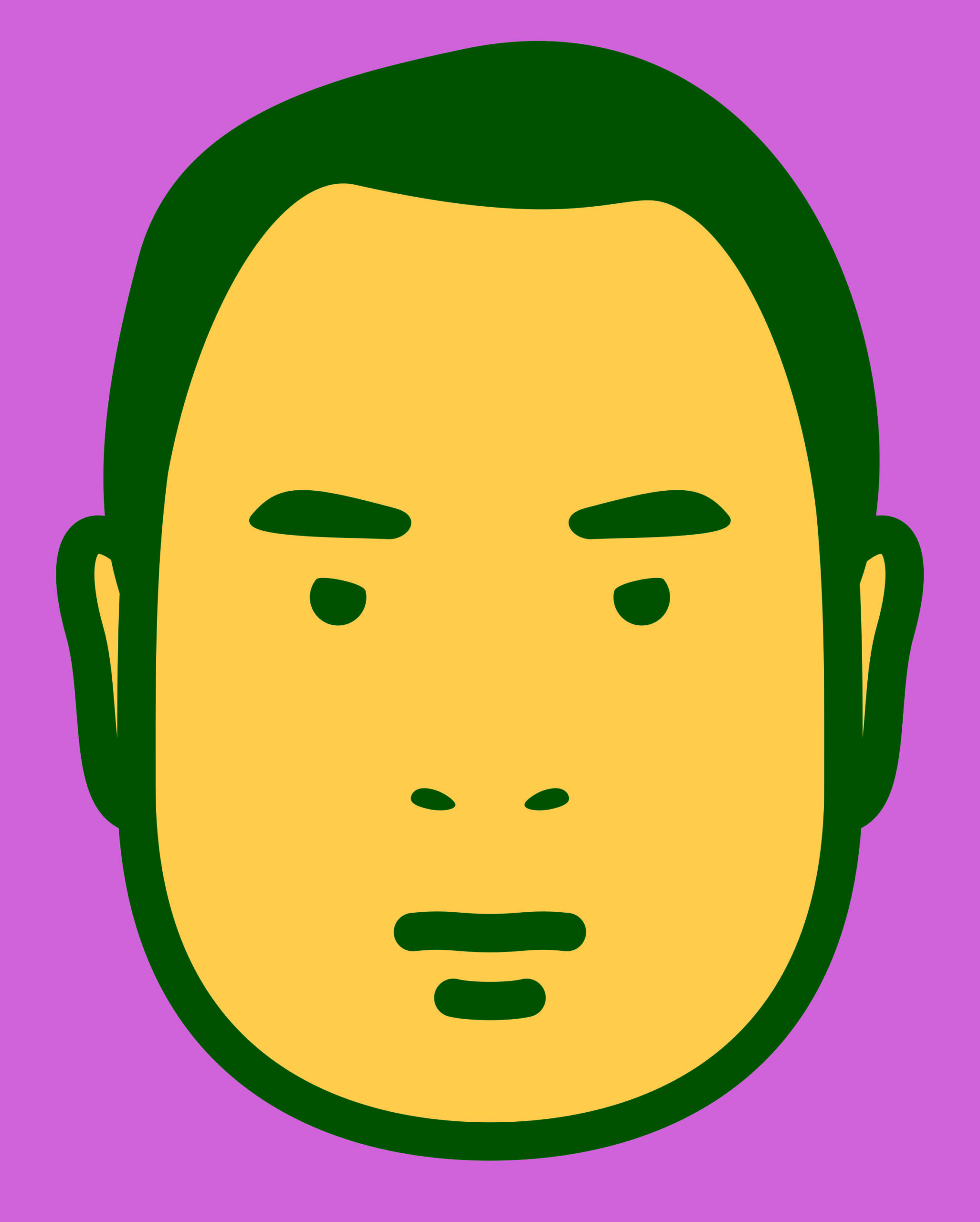
Ananya. 2025
Wallpaper
120 x 95,5 cm
Unlimited Edition
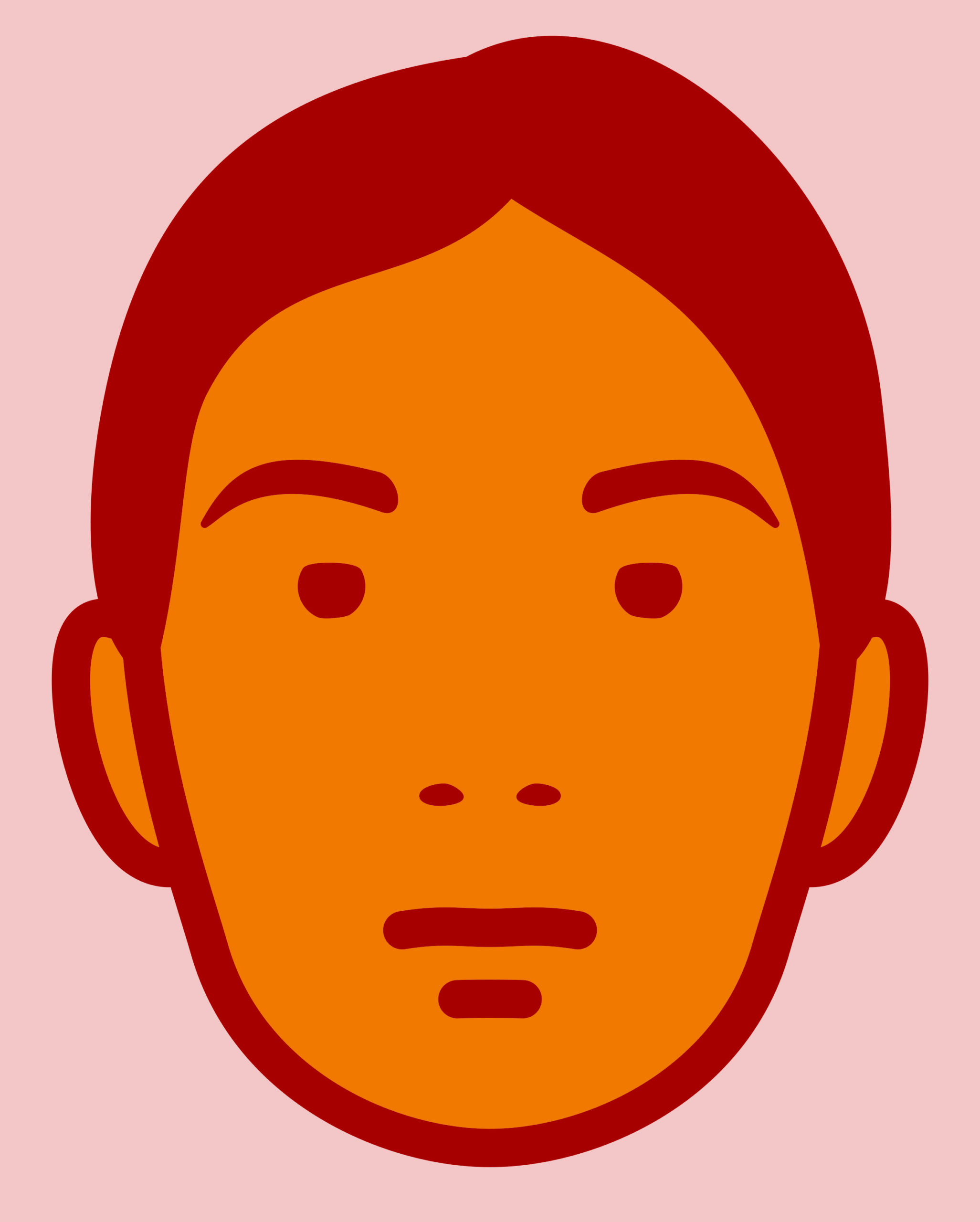
Swetha. 2025
Wallpaper
120 x 95,5 cm
Unlimited Edition